Aura Beauty
A user-friendly shopping experience.

Project Overview
Background
Aura Beauty is a clean and sustainable skincare company focused on educating consumers on skincare. Skincare can be a difficult-to-navigate industry—there are so many products available that target different concerns or skin types, so it can become difficult for consumers to find the right products. By providing ingredient transparency and educational resources, Aura Beauty hopes to create a simple and user-friendly personalized shopping experience for its customers. To do so, Aura Beauty needs a responsive e-commerce website that effectively communicates its unique brand.
The Goal
Create a responsive website for Aura Beauty that is user-friendly and communicates its goal of ingredient transparency and consumer education, as well as a branding kit with a logo.
Project Duration
February 2023 - March 2023
Role
UI/UX designer, graphic designer
Figma, Adobe XD
This project is a fictitious scenario, created as part of Google’s UX Design Professional Certificate.
Tools
Understanding the User
User Research
To begin the design process, I conducted user interviews to understand common behaviors and experiences of users shopping for skincare products. These user interviews revealed the following:
Users appreciate transparency: Users want a list of ingredients, information on testing, and an overview of sustainability practices. Some users value sustainability and clean ingredients, making this information crucial to their purchasing decisions. Others want to ensure that products do not contain any potential irritants or allergens.
Reviews provide valuable insight from real customers: Users noted shopping online can be frustrating because they cannot interact with a product personally. Reviews provide valuable insights and opinions from those who have used the product. Reading reviews can help customers make more informed decisions by giving them an idea of how effective the product is, how it feels on the skin, and whether it lives up to its claims. This allows users to make more confident choices when it comes to their skincare routine.
Personalized recommendations make the shopping process easier: Everyone's skin is unique, and what works for one person may not work for another. Personalized recommendations take into account an individual's skin type, concerns, preferences, and lifestyle factors to create a tailored skincare routine that addresses their specific needs. Additionally, personalized recommendations can help customers save time, money, and frustration by avoiding products that are not suitable for their skin.
Starting the Design
Competitive Analysis
In today's crowded skincare market, it's important to understand what sets a website apart from the competition. I conducted a competitive analysis of several skincare websites to evaluate their strengths and weaknesses in terms of user experience. By analyzing factors such as site navigation, content organization, product information, and checkout flow, I was able to identify opportunities for improvement and gain insights into best practices.
Insights
All sites provided multiple ways to browse products. The main navigations typically provided options to shop by product type, skin concern, skin type, trends, and product collection. Paula’s Choice offered the most browsing categories, each of which contained multiple subcategories. It is worth wondering if the availability of all these choices could make navigating the site overwhelming, or if it allows users to find their desired product(s) more efficiently.
Three sites provided skincare quizzes that allowed users to receive personalized recommendations. Questions in these quizzes regarded skin type, primary skin concern(s), daily environment, lifestyle, and makeup usage.
All sites listed all ingredients on product pages. Typically, the key ingredients (such as active ingredients) were highlighted. A full list of ingredients follows.
All sites provided skincare education resources. Paula’s Choice provided the most extensive resources—a skincare dictionary, an ingredient checker, and a blog—all of which were developed by doctors and industry experts. However, this might not be useful or understandable to all users. Other sites provided pages explaining the key ingredients and brand philosophy, guides for how to build routines and understand different products/ingredients, or beauty blogs. These resources are typically simple and relate directly to the brand’s philosophy and product offering.
Opportunities for Aura Beauty
Provide guides about skincare ingredients and skincare routines. These guides should be simple and user-friendly—they should contain dense language that might be difficult to understand or overwhelming
Create a skincare quiz that can create personalized product recommendations for users. The results of this quiz could be saved to a user’s account so they can refer back to them at a later time.
Provide at least three ways to browse products—this can be kept simple by including categories for bestsellers, product type, skin concern, and skin type.
Paper Wireframes
Employing the information collected from user research and the competitive analysis once again, I sketched out user-centered pages that captured Aura Beauty’s brand and dedication to skincare education. I wanted to explore engaging but digestible ways to display information about products, ingredients, and skincare routines.

Digital Wireframes & Low-Fidelity Prototype
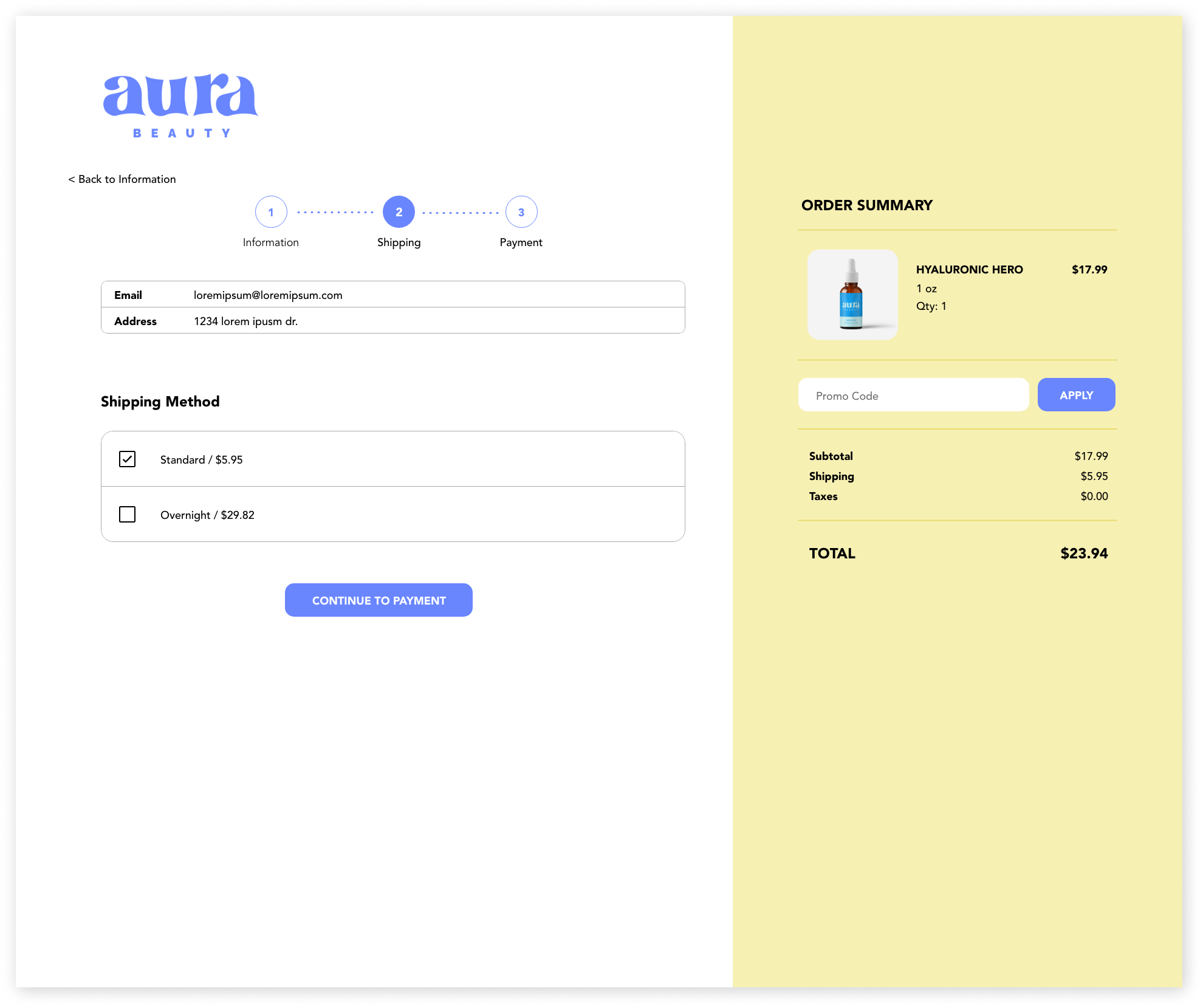
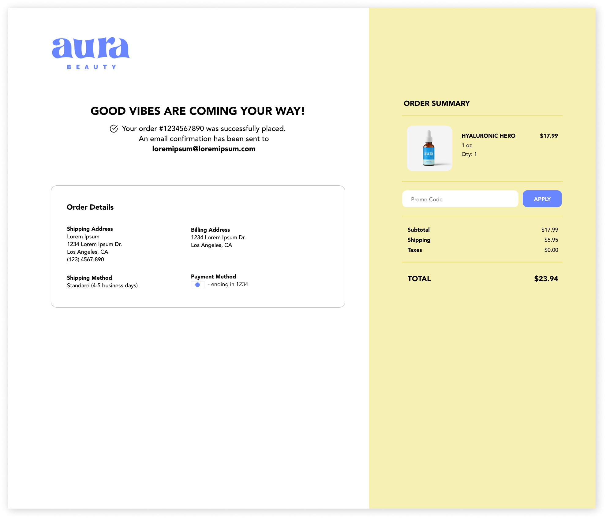
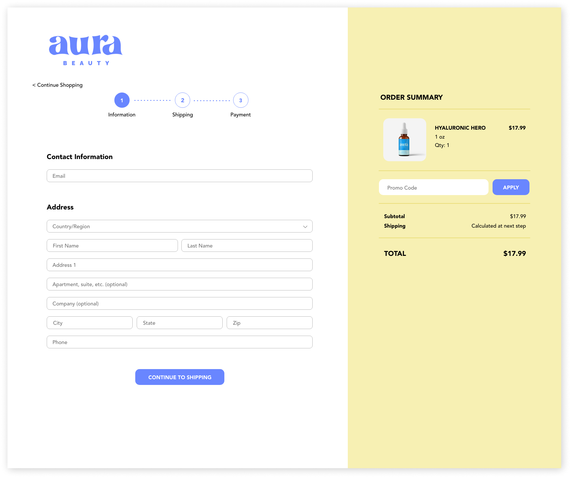
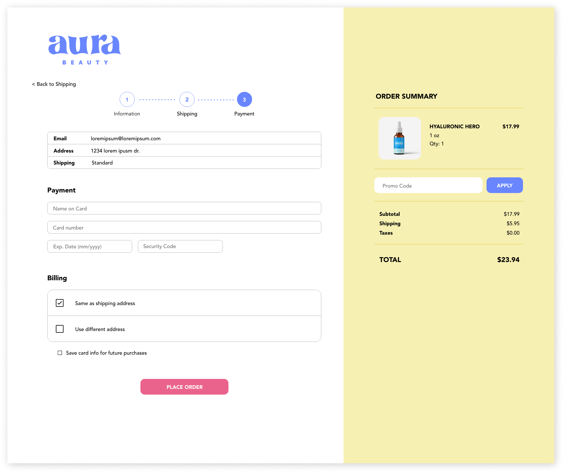
I refined my ideas further by creating digital wireframes. Using these digital wireframes, I created a low-fidelity prototype and explored how users might interact with the product. My primary goal was to make the user experience informational and intuitive—the site needed to encompass the brand philosophy of Aura Beauty, even before adding branding, but also be predictable and easy for users to navigate. I focused this prototype on the purchasing flow. See the homepage, product category, and product listing wireframes from the low-fidelity prototype below.

User Testing Feedback
The low-fidelity prototype was tested on four users. In this early stage, I wanted to know if users could successfully navigate the purchasing flow and their attitudes about the process. I also wanted to know if users could sense the site’s commitment to skincare education and transparency.
Users felt that the site was structured intuitively and navigated through the purchasing flow with ease. Users also enjoyed the emphasis on ingredients and transparency, as well as the availability of reviews.
Testing also identified areas of improvement:
Increase the site navigation font size.
Include the number of reviews/ratings at the top of the product page since ratings are one of the most important sources of information for users (a 4-star rating from 100 reviews differs from a 4-star rating from 2 reviews).
The accordion on the product listing page looks like a drop-down menu, possibly to select size or some other option.
Before moving on to creating mockups and a high-fidelity prototype, I made sure to add these improvements to my wireframes so I could reference them throughout the rest of the design process.
Refining the Design
Branding
To create Aura Beauty’s brand kit, I focused heavily on the definition of the word “aura”—the distinctive energy or quality that emanates from a living being (Merriam-Webster)—and uses of the word “aura” in various cultures. Auras typically describe one’s mood, emotions, or “overall vibe,” typically distinguished by color.
To encapsulate these ideas, I wanted Aura Beauty’s brand to feel funky, bold, and playful. I wanted to emphasize the idea of “bringing out one’s aura through radiant skin.”
For the logo, I chose a funky, wavy font (tommy font) and created a 7-pointed star, representing the 7 aura colors. I chose Avenir, a simple san serif font, to balance out the playful nature of the logo.

The Final Design
View the final key mockups and the high-fidelity prototype below!
Homepage (Desktop & Mobile)


Product Selection


Checkout Sequence


High-Fidelity Prototype
See the site in action!
Next Steps + Final Thoughts
The goal of this project was to create a skincare e-commerce site for Aura Beauty, a clean skincare brand focused on transparency and skincare education. Due to the often complicated and confusing nature of skincare, users need simple, informative, and personalized ways to shop. Through user research and iterative prototyping, I was able to create a product that responds to Aura Beauty’s users’ needs.
This project ideated the full website, though only the purchasing flow has been completed thus far. The next steps in this project include designing the skincare quiz and skincare dictionary. The results of this skincare quiz would then be incorporated into the purchasing flow to create a completely personalized shopping experience.
As a skincare enthusiast myself, I enjoyed working on a topic that sparks personal passion. Formally exploring the skincare industry, ideating the ideal website, and creating the brand from scratch was an enlightening process that I hope to continue developing to full completion.

