BreadBox
Creating a simple and usable mobile ordering experience.

Project Overview
The Problem
BreadBox is a sandwich shop with locations in New York City. BreadBox aims to provide high-quality affordable subs and sandwiches and targets on-the-go customers who value an efficient pickup/delivery process. To achieve this goal, BreadBox needs to provide customers with a quick and easy way to order and pick up meals.
The Goal
Create a mobile app that will let users place orders ahead, allowing busy professionals who are pressed for time to skip the line and reduce idle wait time.
Project Duration
February 2023 - March 2023
Role
UI/UX designer
Figma
This project is a fictitious scenario, created as part of Google’s UX Design Professional Certificate.
Tools
Understanding the User
User Research
My research goals were as follows:
To identify common user behaviors and experiences the app is trying to address.
To understand what kinds of options users need for a mobile-ordering app.
I conducted interviews, identified personas, and generated user journey maps to understand users’ problems and needs. Through this process, I discovered that the primary user group for this product is working professionals who have limited time during the workday and require efficient ways to get meals.
Research Findings
Two major findings were revealed through these interviews:
Time: Working professionals often do not have the time or energy to prepare their own meals or have short lunch breaks during the work day. The ability to order food ahead of time through a website or mobile app makes getting meals easy—it takes away the oftentimes stressful elements of having to order a meal in person and wait for the meal to be ready.
Customization Options: Users like to know the ingredients in their meals and have the ability to customize them. Some customers might be picky or have allergies—knowing the ingredients in a menu item before ordering can reduce the likelihood of ordering an item that is inedible to the customer.
User Journey Map
To further understand user needs, a user journey map was made for the persona of Olivia. The map describes Olivia’s process of completing a sandwich purchase at BreadBox without a mobile app.

Starting the Design
Paper Wireframes
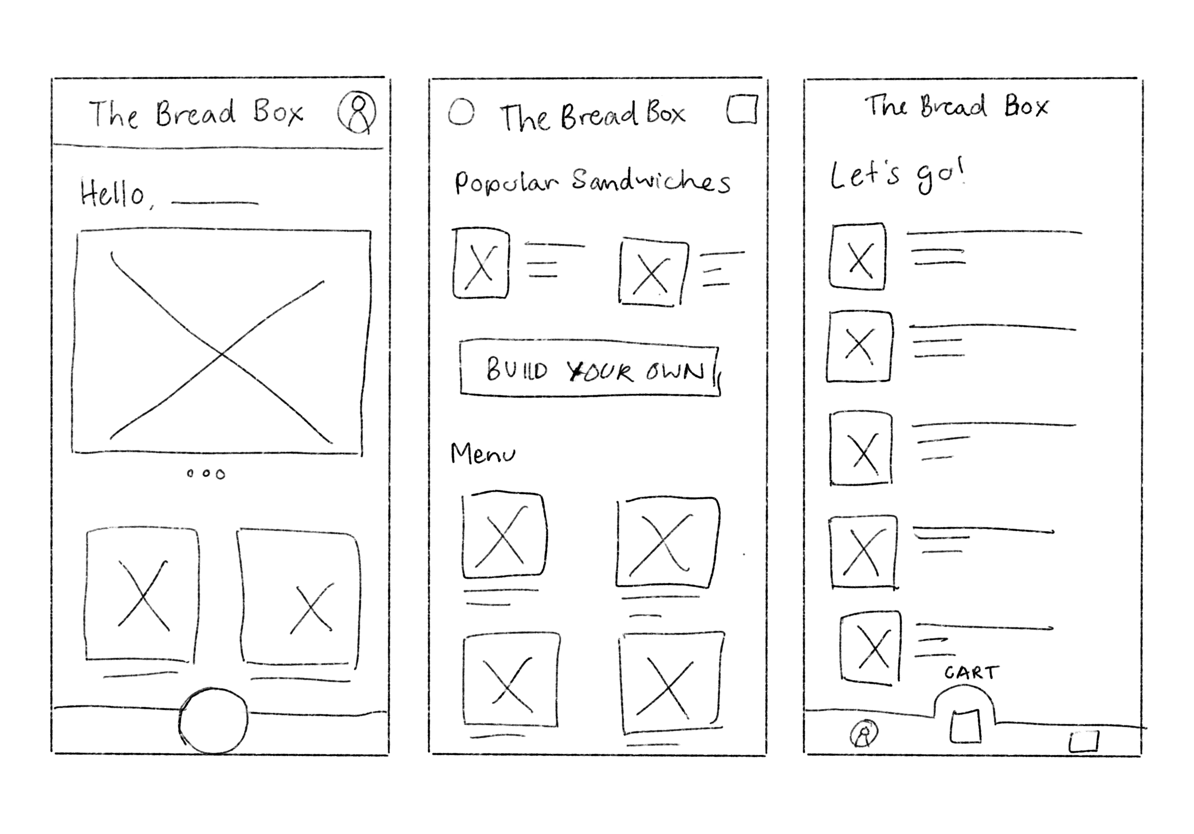
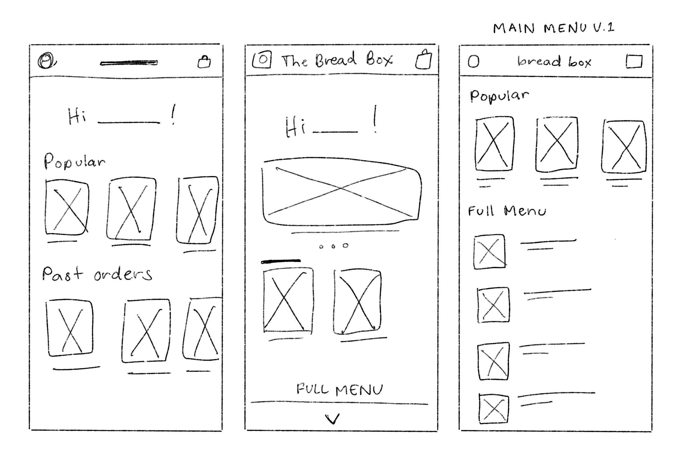
After studying user needs, I moved on to creating paper wireframes. Inspiration was drawn from many existing mobile-ordering apps such as Subway, Jersey Mike’s, and Chipotle.
Iterating on these wireframes helped me brainstorm ideas and elements for the main menu page. One of the most important elements to explore was the navigation bar. I spent time generating different placement and organizational ideas for the top navigation to determine the right design. These iterations culminated in Main Menu V.1 (right), the final refined paper wireframe for the main menu page.


Digital Wireframes

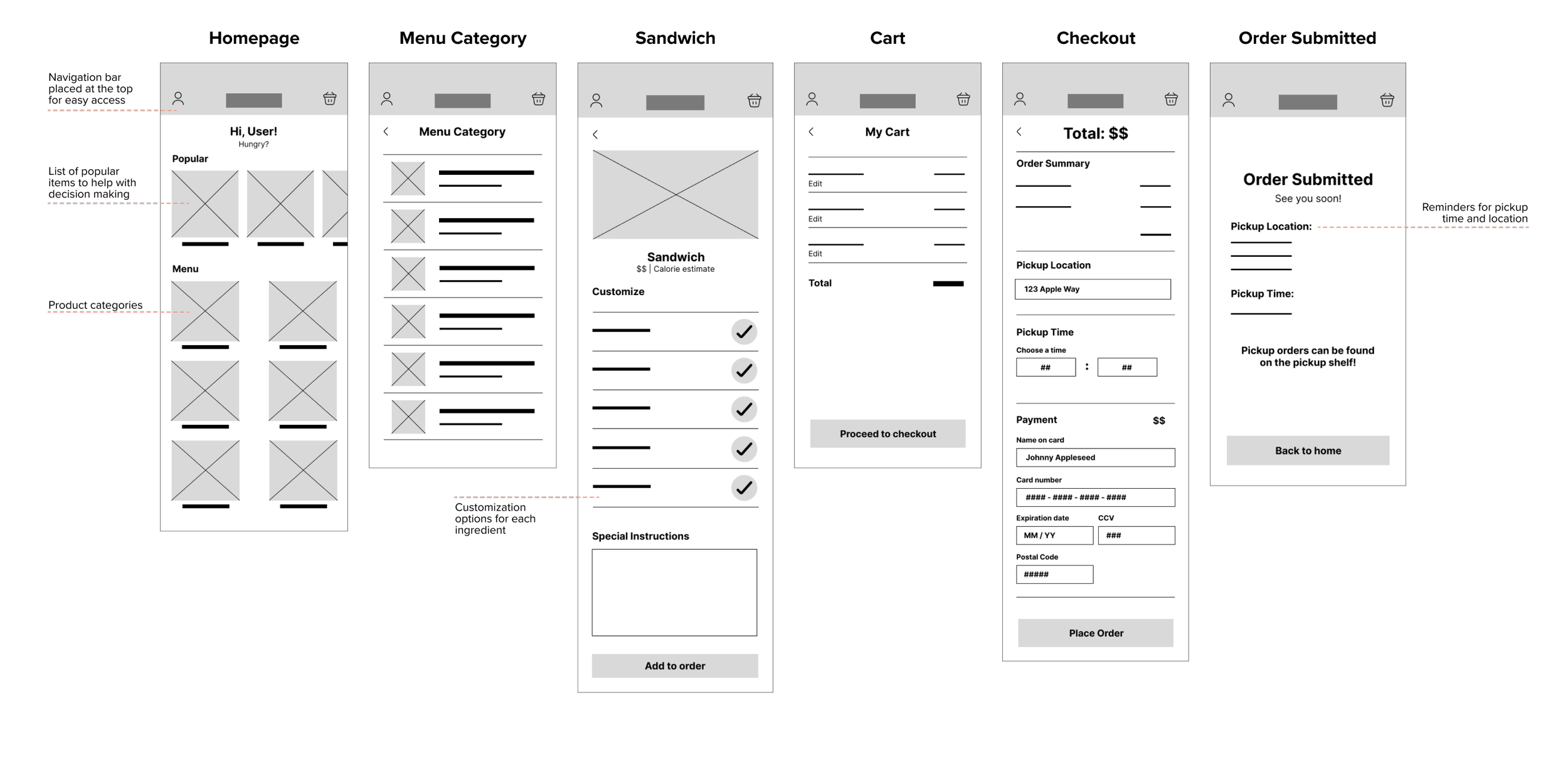
Continuing to digital wireframes, I refined my ideas and focused on how to make the navigation as simple as possible.
Usability Testing
I turned these wireframes into a low-fidelity prototype and tested it on four users. In this early stage, I wanted to know if users could successfully navigate the app and place an order for a sandwich. All users were able to complete all tasks in under 5 minutes, which confirmed that the flow was logical and intuitive.
In addition, 3 areas for improvement were identified in testing:
Picking a location: Users felt that picking a location should be shown earlier in the flow, preferably at the very beginning instead of at the checkout stage. Most apps require users to choose their preferred pickup location or delivery address before starting an order—available ingredients or menu items can differ from store to store.
Checkout page: Users wanted options to save their credit cards for future orders. This would simplify the ordering process for returning customers. Users also wanted options to receive a receipt outside of the app, i.e., through text or email.
Delivery option: A delivery option was not included in the original design—users searched for one in the checkout process, though only a pickup option is provided. Including a delivery option would cater to more users’ needs.
Refining the Design

Branding
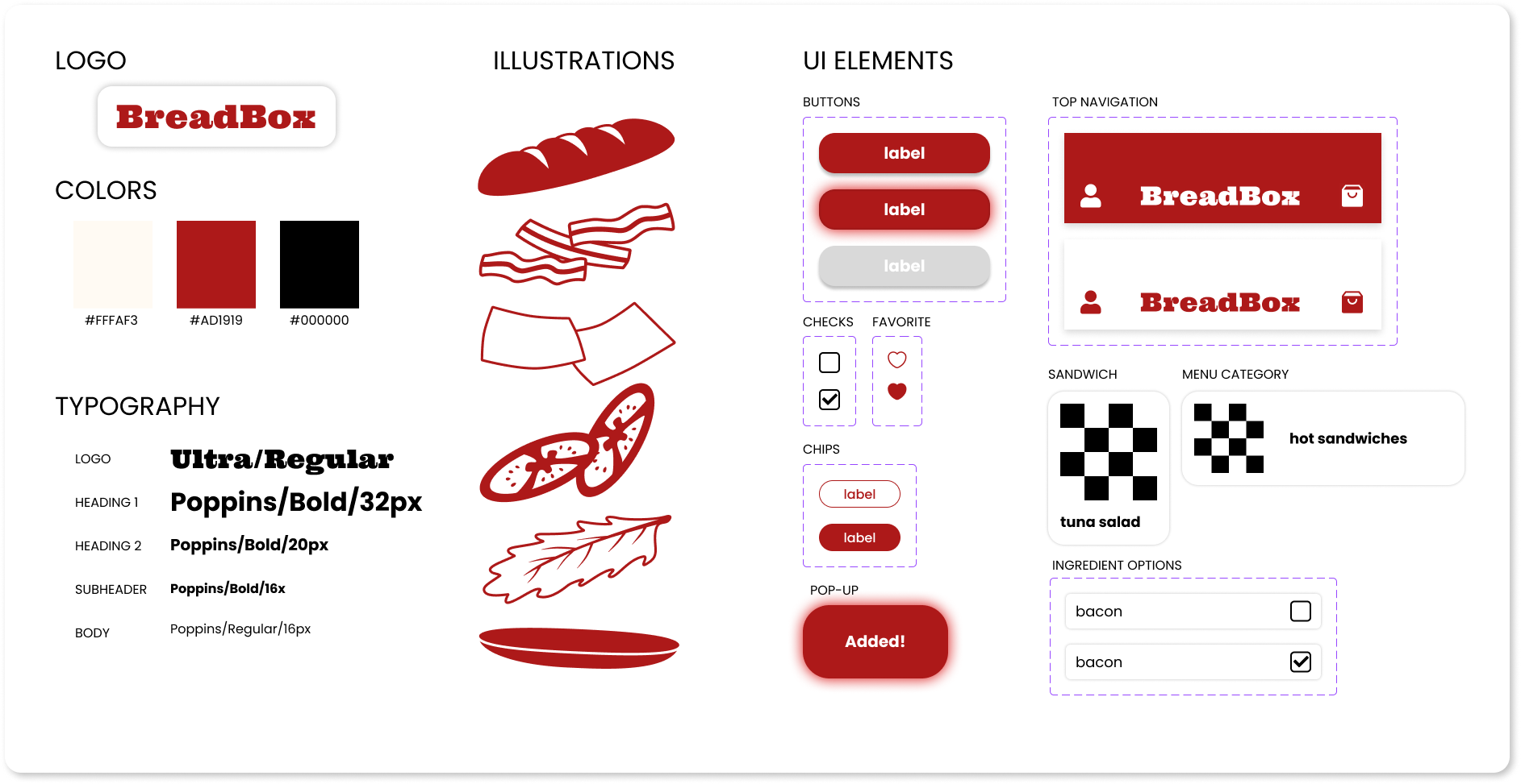
Before moving on to designing the high-fidelity prototype, I designed a brand identity for BreadBox. Inspiration for the brand was drawn through mood boards on Behance and Pinterest. Using these mood boards, I identified attributes that would encapsulate Breadbox’s brand: playful, simple, fresh, and creative. With these attributes in mind, I created a stylesheet and UI elements for BreadBox that I ultimately implemented in the final high-fidelity prototype.

High-Fidelity Prototype
The final high-fidelity prototype included improvements to the areas identified in the usability test. Try placing an order for a BLT using the prototype below!
Final Thoughts
The goal of this project was to create a mobile ordering app for BreadBox, a sandwich shop with locations in New York City. This app would help BreadBox provide high-quality, affordable subs and sandwiches to on-the-go customers who value an efficient pickup/delivery process. Through user research and iterative prototyping, I was able to create a product that responds to BreadBox’s users’ needs.
The final design creates a simple process for customers of BreadBox—such as Olivia and Liam—to place pickup and delivery orders remotely, allowing them to cut down their wait time and easily customize their orders. One lesson learned from this project is knowing when to call a design complete. I spent a lot of time iterating on the final design, playing with different interactions, adjusting the UI, and exploring branding. Without a deadline, I knew that I could tinker with it forever. However, I needed to finally decide that the project was finished at some point. Knowing when to call the project finished can be difficult for someone who likes to analyze every detail, but it’s an important skill to have in order to keep a focus on the big picture.

